RangeInput creates a numeric range slider UI component with input fields. It works in the same way as RangeSlider.
Example uses:
- filtering products from a price range in an e-commerce shopping experience.
- filtering flights from a range of departure and arrival times.
Usage
Basic Usage
<template>
<range-input
dataField="ratings_count"
componentId="BookSensor"
title="RangeInput: Ratings"
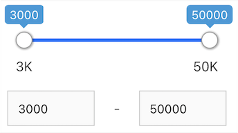
:range="{
start: 3000,
end: 50000
}"
/>
</template>RangeInput provides all the props supported by RangeSlider.
Usage With All Props
<template>
	<range-input
		componentId="RatingsSensor"
		dataField="ratings_count"
		:range="{
			start: 3000,
			end: 50000,
		}"
		:rangeLabels="{
			start: '3K',
			end: '50K',
		}"
		:defaultValue="{
			start: 10000,
			end: 30000
		}"
		title="Ratings Filter"
		:stepValue="1"
		:includeNullValues="true"
		className="component-wrapper"
		:validateRange="validateInputChange"
		:value="this.$data.currentValue"
		@change="handleChange"
		@value-change="handleValueChange"
	/>
</template>
Props
- componentId
Stringunique identifier of the component, can be referenced in other components'reactprop. - dataField
StringDB data field to be mapped with the component's UI view. The selected range creates a database query on this field. - range
Objectan object withstartandendkeys and corresponding numeric values denoting the minimum and maximum possible slider values. - nestedField
String[optional] use to set thenestedmapping field that allows arrays of objects to be indexed in a way that they can be queried independently of each other. Applicable only when dataField is a part ofnestedtype. - title
String or JSX[optional] title of the component to be shown in the UI. - defaultValue
Object[optional] selects a initial range values usingstartandendkey values from one of the data elements. - value
Object[optional] controls the current value of the component.It selects the data from the range (on mount and on update). Use this prop in conjunction withchangeevent. - validateRange
function[optional] is a callback function that can be used to validate the range input values before applying it. This function accepts an array of numbers where first element represents thestartrange and second element represents theendrange. The following example prevents the users to type negative value for start range input.
<template>
	<range-input
		:validateRange="([start, end]) => {
            if(start <= end) {
                return true;
            }
            return false;
        }"
	/>
</template>- rangeLabels
Object[optional] an object withstartandendkeys and correspondingStringlabels to show labels near the ends of theRangeInputcomponent. - showFilter
Boolean[optional] show the selected item as a filter in the selected filters view. Defaults totrue. - snap
Boolean[optional] makes the slider snap on to points depending on thestepValuewhen the slider is released. Defaults totrue. When set tofalse,stepValueis ignored. - stepValue
Number[optional] step value specifies the slider stepper. Value should be an integer greater than or equal to1and less thanMath.floor((range.end - range.start) / 2). Defaults to 1. - URLParams
Boolean[optional] enable creating a URL query string parameter based on the selected value of the list. This is useful for sharing URLs with the component state. Defaults tofalse. - includeNullValues
Boolean[optional] If you have sparse data or document or items not having the value in the specified field or mapping, then this prop enables you to show that data. Defaults tofalse.
Demo
Styles
RangeInput component supports innerClass prop with the following keys:
slider-containerinput-container
The other innerClass properties are the same as supported by RangeSlider.
Extending
RangeInput component can be extended to
- customize the look and feel with
className, - update the underlying DB query with
customQuery, - connect with external interfaces using
beforeValueChange,valueChangeandqueryChange, - filter data using a combined query context via the
reactprop, - as a controlled component using
valueprop andchangeevent.
<template>
	<range-input
		className="custom-class"
		:customQuery="getCustomQuery"
		:react="react"
		:beforeValueChange="handleBeforeValueChange"
		@valueChange="handleValueChange"
		@queryChange="handleQueryChange"
	/>
</template>
<script>
	export default {
		name: 'app',
		methods: {
			getCustomQuery: (value, props) => {
				return {
					query: {
						match: {
							price: 1000,
						},
					},
				};
			},
			handleBeforeValueChange: value => {
				// called before the value is set
				// returns a promise
				return new Promise((resolve, reject) => {
					// update state or component props
					resolve();
					// or reject()
				});
			},
			handleValueChange: value => {
				console.log('current value: ', value);
				// set the state
				// use the value with other js code
			},
			handleQueryChange: (prevQuery, nextQuery) => {
				// use the query with other js code
				console.log('prevQuery', prevQuery);
				console.log('nextQuery', nextQuery);
			},
		},
		computed: {
			react() {
				return {
					and: ['pricingFilter', 'dateFilter'],
					or: ['searchFilter'],
				};
			},
		},
	};
</script>-
className
StringCSS class to be injected on the component container. -
customQuery
Functiontakes value and props as parameters and returns the data query to be applied to the component, as defined in Elasticsearch Query DSL.Note: customQuery is called on value changes in the RangeInput component as long as the component is a part of
reactdependency of at least one other component. -
beforeValueChange
Functionis a callback function which accepts component's future value as a parameter and returns a promise. It is called everytime before a component's value changes. The promise, if and when resolved, triggers the execution of the component's query and if rejected, kills the query execution. This method can act as a gatekeeper for query execution, since it only executes the query after the provided promise has been resolved. For example,beforeValueChange = value => { // The update is accepted by default if (value.start > 3000) { // To reject the update, throw an error throw Error('Start value must be less than or equal to 3000.'); } };
Events
- queryChange is an event which accepts component's prevQuery and nextQuery as parameters. It is called everytime the component's query changes. This event is handy in cases where you want to generate a side-effect whenever the component's query would change.
- valueChange is an event which accepts component's current value as a parameter. It is called everytime the component's value changes. This event is handy in cases where you want to generate a side-effect on value selection.For example: You want to show a pop-up modal with the valid discount coupon code when some range is selected in a “Discounted Price” RangeInput.
- change is an event which accepts component's current value as a parameter. It is called when you are using the value prop and the component's value changes.
<template>
    <range-input
        // ...other props
        value="value"
        @change="handleChange"
    />
</template>

<script>
export default {
  name: 'app',
    data() {
        return {
            value: {
  			  start: 3000,
  			  end: 50000
  		  }
        }
    },
    methods: {
        handleChange(value) {
            this.value = value;
        }
    }
};
</script>
Examples
See more stories for RangeInput on Vue playground.
RangeInput component with basic props
RangeInput component with title
RangeInput component with default value


