ToggleButton creates a toggle button UI component that is connected to a database field. It is used for filtering results based on a fixed set of toggle-able options.
Example uses:
- filter movies by ratings between 1 and 5,
- display restaurants that accept delivery and are open now,
- show flight tickets by one way, round trip and multi-city options.
Usage
Basic Usage
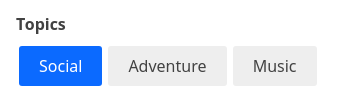
<ToggleButton
	componentId="MeetupTops"
	dataField="group_topics.topic_name.raw"
	data={[
		{ label: 'Social', value: 'Social' },
		{ label: 'Travel', value: 'Travel' },
		{ label: 'Outdoors', value: 'Outdoors' },
	]}
/>
Usage With All Props
<ToggleButton
	componentId="MeetupTops"
	dataField="group_topics.topic_name.raw"
	data={[
		{ label: 'Social', value: 'Social' },
		{ label: 'Travel', value: 'Travel' },
		{ label: 'Outdoors', value: 'Outdoors' },
	]}
	title="Meetups"
	defaultValue={['Social']}
	multiSelect={true}
	showFilter={true}
	filterLabel="City"
	URLParams={false}
/>
Props
-
componentId
Stringunique identifier of the component, can be referenced in other components'reactprop. -
dataField
Stringdata field to be connected to the component's UI view. -
data
Object Arraycollection of UIlabelswith associatedvalueto be matched against the database field. -
nestedField
String[optional] use to set thenestedmapping field that allows arrays of objects to be indexed in a way that they can be queried independently of each other. Applicable only when dataField is a part ofnestedtype. -
title
StringorJSX[optional] title of the component to be shown in the UI. -
defaultValue
StringorArray[optional] an array of default selected label(s) to pre-select one or more buttons. -
value
String Array[optional] controls the current value of the component. It selects the label (on mount and on update). Use this prop in conjunction withonChangefunction. -
multiSelect
Boolean[optional] whether multiple buttons can be selected, defaults to true. When set to false, only one button can be selected. -
showFilter
Boolean[optional] show as filter when a value is selected in a global selected filters view. Defaults totrue. -
filterLabel
String[optional] An optional label to display for the component in the global selected filters view. This is only applicable ifshowFilteris enabled. Default value used here iscomponentId. -
URLParams
Boolean[optional] enable creating a URL query string parameter based on the selected value of the list. This is useful for sharing URLs with the component state. Defaults tofalse. -
onChange
function[optional] is a callback function which accepts component's current value as a parameter. It is called when you are using thevalueprops and the component's value changes. This prop is used to implement the controlled component behavior. -
enableStrictSelection
Boolean[optional] When set totrue, a selected option can't be unselected. Although, it is possible to change the selected option. Defaults tofalse.Note: This only works when
multiSelectprop is set tofalse.
Demo
Styles
ToggleButton component supports innerClass prop with the following keys:
titlebutton
Read more about it here.
Extending
ToggleButton component can be extended to
- customize the look and feel with
className,style, - update the underlying DB query with
customQuery, - connect with external interfaces using
beforeValueChange,onValueChangeandonQueryChange.
<ToggleButton
  ...
  className="custom-class"
  style={{"paddingBottom": "10px"}}
  customQuery={
    function(value, props) {
      return {
        query: {
          match: {
            data_field: "this is a test"
          }
        }
      }
    }
  }
  beforeValueChange={
    function(value) {
      // called before the value is set
      // returns a promise
      return new Promise((resolve, reject) => {
        // update state or component props
        resolve()
        // or reject()
      })
    }
  }
  onValueChange={
    function(value) {
      console.log("current value: ", value)
      // set the state
      // use the value with other js code
    }
  }
  onQueryChange={
    function(prevQuery, nextQuery) {
      // use the query with other js code
      console.log('prevQuery', prevQuery);
      console.log('nextQuery', nextQuery);
    }
  }
/>-
className
StringCSS class to be injected on the component container. -
style
ObjectCSS styles to be applied to the ToggleButton component. -
customQuery
Functiontakes value and props as parameters and returns the data query to be applied to the component, as defined in Elasticsearch Query DSL.Note:customQuery is called on value changes in the ToggleButton component as long as the component is a part ofreactdependency of at least one other component. -
beforeValueChange
Functionis a callback function which accepts component's future value as a parameter and returns a promise. It is called everytime before a component's value changes. The promise, if and when resolved, triggers the execution of the component's query and if rejected, kills the query execution. This method can act as a gatekeeper for query execution, since it only executes the query after the provided promise has been resolved.Note:
If you're using Reactivesearch version >=
3.3.7,beforeValueChangecan also be defined as a synchronous function.valueis updated by default, unless you throw anErrorto reject the update. For example:beforeValueChange = values => { // The update is accepted by default if (values.includes('Social')) { // To reject the update, throw an error throw Error('Selected value should not include Social.'); } }; -
onValueChange
Functionis a callback function which accepts component's current value as a parameter. It is called everytime the component's value changes. This prop is handy in cases where you want to generate a side-effect on value selection. For example: You want to show a pop-up modal with the valid discount coupon code(s) when button(s) is/are selected in a "Discounted Price" ToggleButton. -
onQueryChange
Functionis a callback function which accepts component's prevQuery and nextQuery as parameters. It is called everytime the component's query changes. This prop is handy in cases where you want to generate a side-effect whenever the component's query would change. -
index
String[optional] The index prop can be used to explicitly specify an index to query against for this component. It is suitable for use-cases where you want to fetch results from more than one index in a single ReactiveSearch API request. The default value for the index is set to theappprop defined in the ReactiveBase component.Note: This only works when
enableAppbaseprop is set to true inReactiveBase.


